Getting Started
To access Flowable Work you need to type in the navigation URL into your browser. Once the page is loaded, the login page appears.
 note
noteYour system administrator should provide you with the URL. The URL is typically
something like https://<hostmachine>:<port>/flowable-work/.
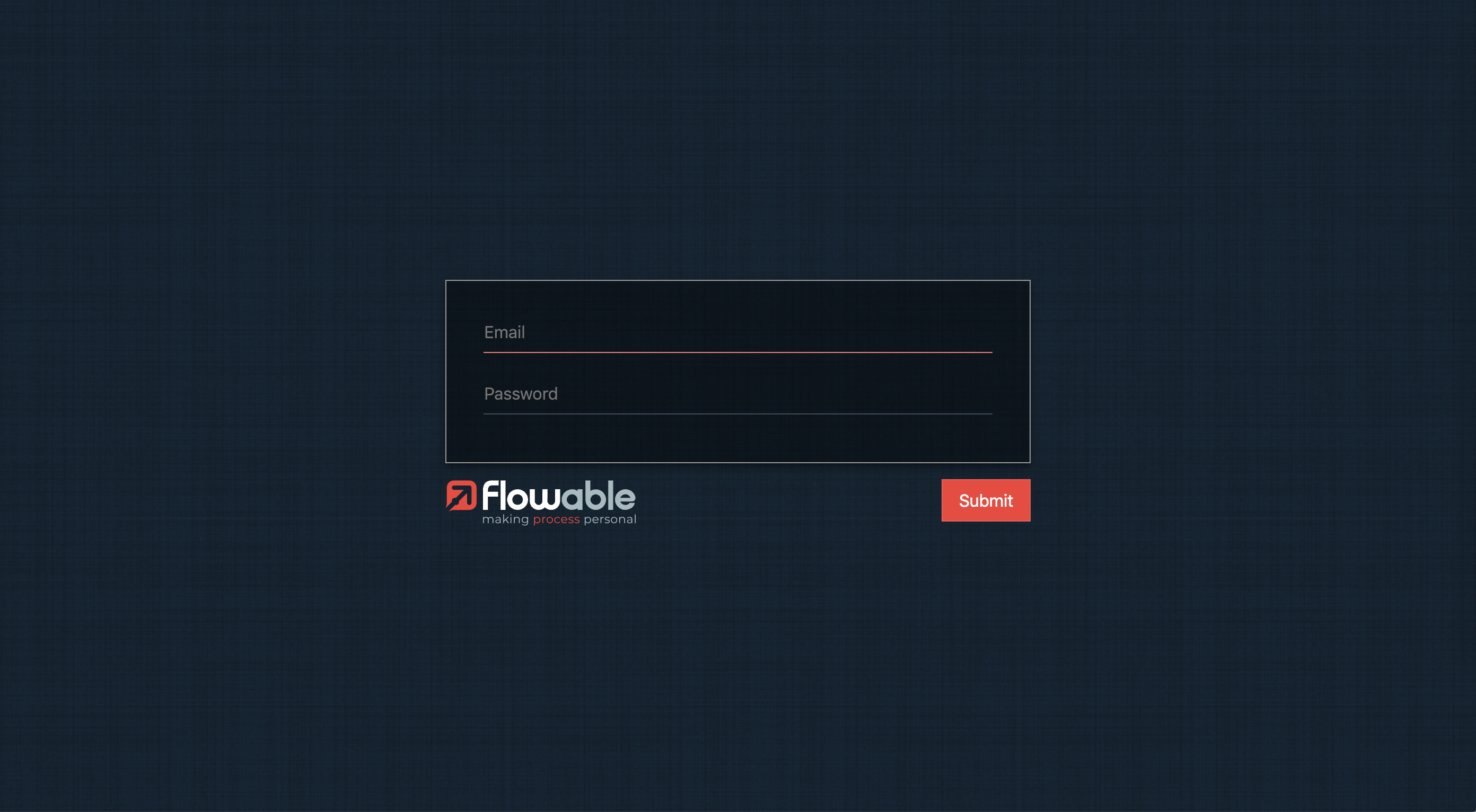
In order to log in, you need to type in your login and password on the form and
click on the Submit button.

User Interface
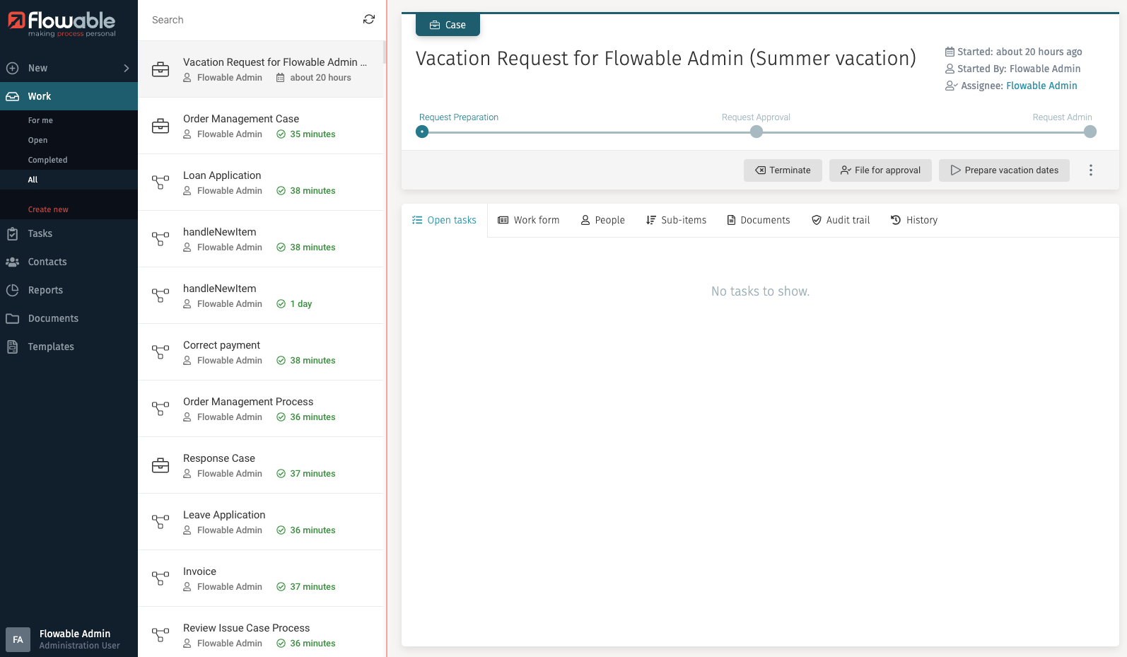
This is the main Flowable Work web interface that appears after logging in:
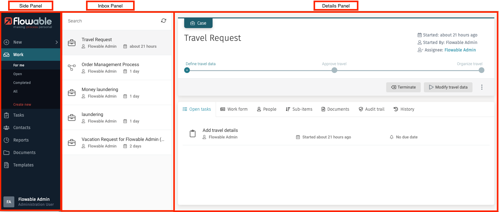
Side Panel
The side panel contains the main navigation of Flowable Work. It helps you to orient yourself within the application.
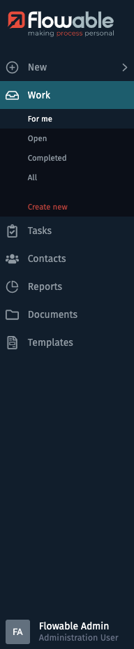
On the top you can find the New button. It allows you to create work
items (cases or processes).
The next button is Work. When clicking on it, you are routed to your
work Inbox, that displays all your work items. It also expands the Work
menu to show different submenu items. Each of the submenu items is configured
to only display a specific subset of work items in your inbox, e.g., show only
work items where you are involved or show only completed work items.
For more information see the section Work.
Below the Work button is the Tasks button. When clicking on
the button you are
routed to your task Inbox, which displays all your tasks. It also expands the
Tasks menu to show different submenu items. Each of the submenu items is
configured to only display a specific subset of tasks in your inbox, e.g., show only
tasks where you are involved or show only tasks that are not assigned to anybody.
For more information see the section Tasks.
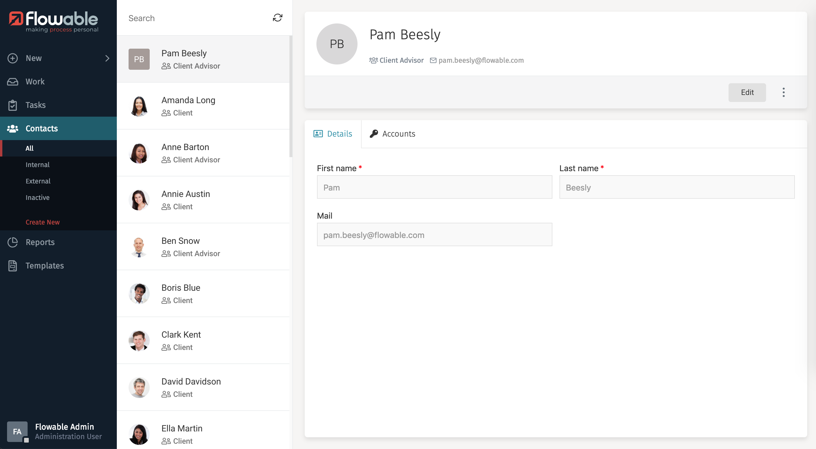
In the Contacts section you can manage your contacts, e.g., you can
find the details of the user profiles with which you can interact.
To discover all features of the contact management have a look at the chapter
about Contacts.
The Reports section lets you access a dashboard that provides a
quick overview of application usage.
If you want to know more see Reports.
noteDepending on the configuration of your web application and the individual user permissions, you may only see some of the menu items in the side panel.
noteBesides the default menu, other applications of the Flowable Portfolio can be integrated into the user interface.
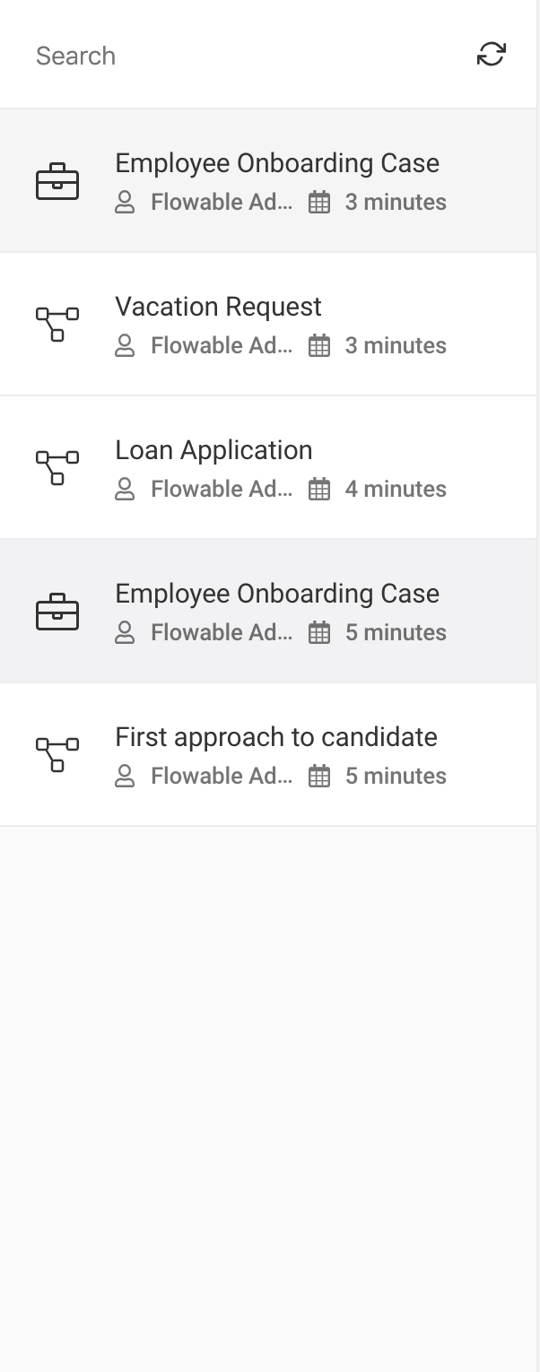
Inbox Panel
The inbox panel has two main areas: a search box and a list section. In the list section items that match the selected criteria from the selected option of the side panel combined with the typed search characters are shown. For example, if you select Work and For me in the submenu, you only see work items where you are involved.
 tip
tipYou can resize the inbox panel to make it wider by placing your mouse in the dividing line between the inbox and the details panel until it changes to a horizontal resize one, then click and resize to your liking.
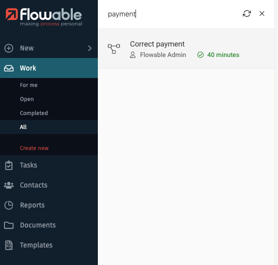
Search Box
At the top of the inbox, you can find a search field that lets you search by name in the displayed list and a refresh button. You can type the full name or even a part of it. To clear your search, press the X button.
Details Panel
The details panel shows the information on the selected item from the inbox panel, letting you overview all case related data, interact with a form if there is one, view the different steps of a process, etc. You can find more information about each variant of the details panel in the specific sections: Work details panel, Task details panel, Contacts details panel.
Create New Items
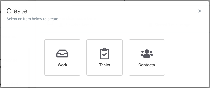
The New function lets you create a new Work, Task or Contact item.

When clicked, a dialog opens in the middle on the screen to select which item you want to create:
New Work
The New function lets you create a new Work, Task, or Contact item.
When clicked, a dialog opens in the middle of the screen to select which item you want to create:
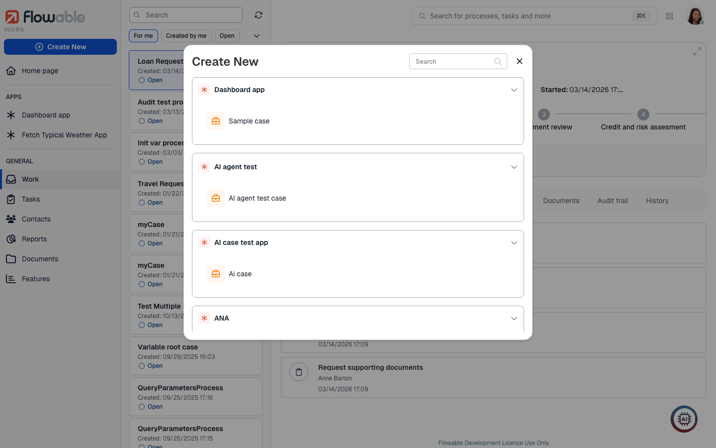
If the first option Work is chosen, the list of available cases and processes are shown, grouped by Flowable App, letting you select which one you want to create. The list is scrollable using your mouse wheel and contains a search box to search by name. You can also collapse app sections for better reading.
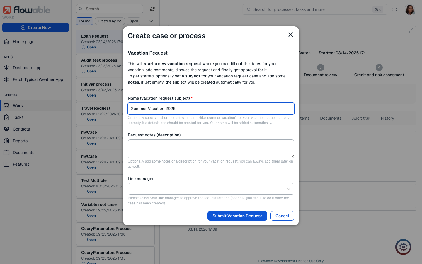
After selecting which work item you want to create, if there is an init form associated to the work item, it would open as a new dialog showing the form so that you can enter the initial values for it, for example:
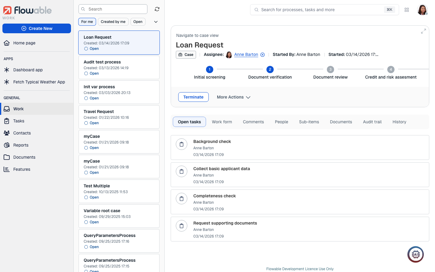
After filling the init form (if there is one), the navigation would take you to the corresponding section of the side panel according to the item you have created, have it selected in the inbox panel, and it is shown in the details panel.
New Tasks
The New function lets you create a new Work, Task, or Contact item.
When clicked, a dialog opens in the middle of the screen to select which item you want to create:
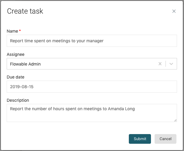
If the second option Tasks is chosen, the window for creating a new Ad hoc task
appears with a simple form that you need to fill to create it. Only the name is
required, as it serves to identify the task in the tasks list. The other two optional
fields are Assignee, in case you want to assign the task to a particular member of your
organization, and Description, which you can use to describe what the task involves, and
what needs to be accomplished for someone to complete the task. Once you have
filled the fields, you can press the Submit button to create it. At any time you can
click on Cancel and the task is not created.
tipYou can use some Markdown features to format the description message.
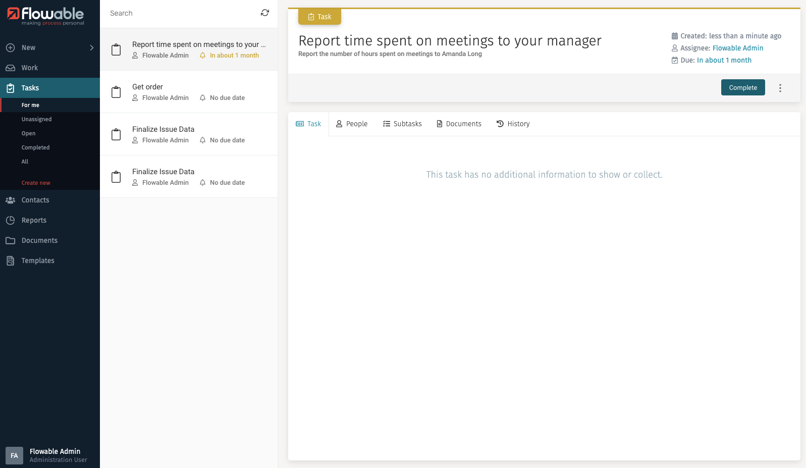
After creating the ad hoc task, the Task main option is selected, and the task is shown in the inbox list, and its details are shown in the details panel. The description of an ad hoc task is displayed below its title.
New Contacts
The New function lets you create a new Work, Task, or Contact item.
When clicked, a dialog opens in the middle of the screen to select which item you want to create:
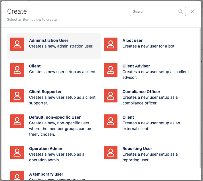
If the third option Contacts is chosen, a window appears which lets you select the profile (also called technically user definition) of the user you want to create. The profile of the contact determines which functions he can access and perform.
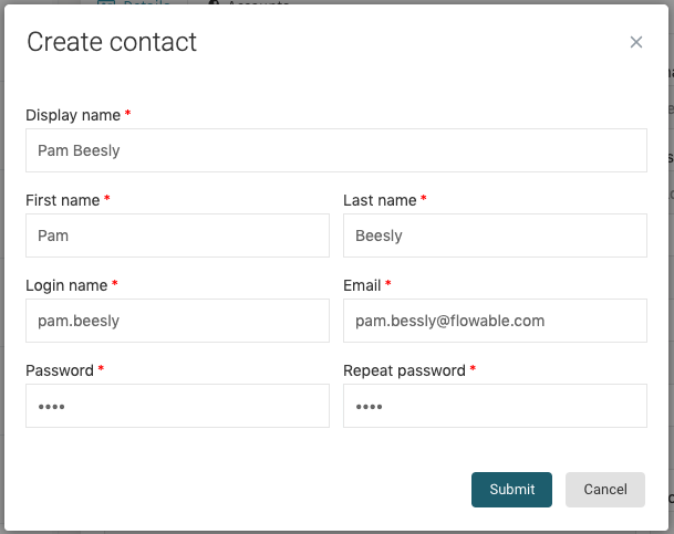
After selecting the profile, the window shows the fields needed for creating the
contact. Mandatory fields are marked with a red asterisk (*) and the fields that are
shown are determined by the profile that was selected. For example, to create an
external client, you need to select a Client advisor for him. Once you have filled in all
mandatory fields, you can press the Submit button.
After creating the contact, the window closes, the Contacts main option is selected in the side panel, and your recently created contact is loaded into the details pane.