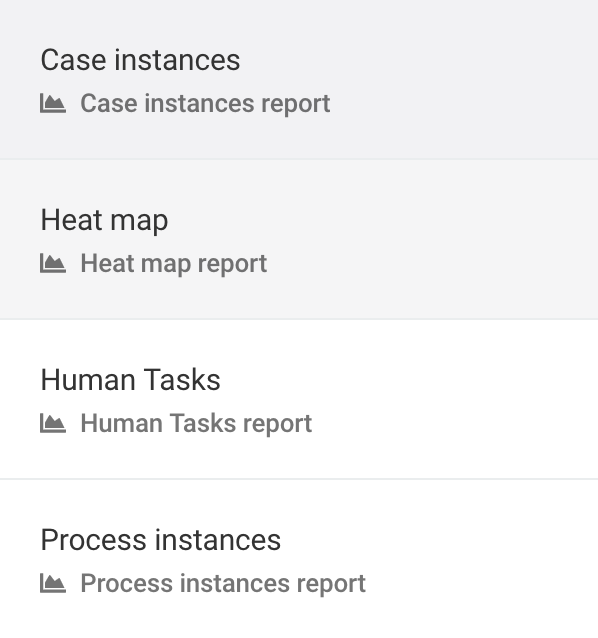
Reports
In the Reports section you can access several application usage diagrams, to get a quick visual understanding of the execution of your work items and tasks.

When you click on Reports, the inbox panel shows you the available items you can get visualizations of.
Process Instances
With this visualization, you can obtain information about your process instances.
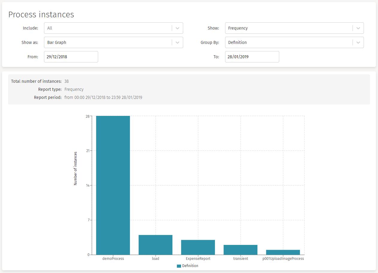
The available options you can use to narrow your diagram are:
-
Include: This option lets you choose a specific process. By default, all processes are included in the graph. After selecting a process, if you want to go back and show all processes again, you can click the X button at the right of the dropdown to deselect the chosen process.
-
Show: With this option you can choose if you want to see the number of instances created (Frequency) or the execution time (Duration). When you choose the Duration option, the Calculate filter appears.
-
Calculate: (Show only if Duration is chosen on the Show filter)
-
Average: Shows the average execution time of the process instances.
-
Minimum: Shows the minimum execution time of the process instances.
-
Maximum: Shows the maximum execution time of the process instances.
-
Total: Shows the total execution time of the process instances.
-
-
-
Show as: With this option you can choose the type of report to obtain. The available graphs are: Bar Graph, Line Graph or Pie Chart.
-
Group by: With this option you can group the report values by Definition, or by Hour, Month, Year, or Week.
-
From - To: With these two options you can narrow the time range where you want your data to be obtained from.
Case Instances
With this visualization, you can obtain information about your case instances.
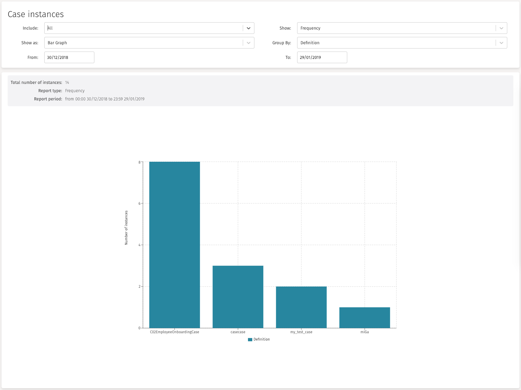
The available options you can use to narrow your diagram are:
-
Include: This option lets you choose a specific process. By default, all processes are included in the graph. After selecting a process, if you want to go back and show all processes again, you can click the X button at the right of the dropdown to deselect the chosen process.
-
Show: With this option you can choose if you want to see the number of instances created (Frequency) or the execution time (Duration). When you choose the Duration option, the Calculate filter appears.
-
Calculate: (Show only if Duration is chosen on the Show filter)
-
Average: Shows the average execution time of the process instances.
-
Minimum: Shows the minimum execution time of the process instances.
-
Maximum: Shows the maximum execution time of the process instances.
-
Total: Shows the total execution time of the process instances.
-
-
-
Show as: With this option you can choose the type of report to obtain. The available graphs are: Bar Graph, Line Graph or Pie Chart.
-
Group by: With this option you can group the report values by Definition, or by Hour, Month, Year, or Week.
-
From - To: With these two options you can narrow the time range where you want your data to be obtained from.
Human Tasks
With this visualization, you can obtain information about your human task instances.

The available options you can use to narrow your diagram are:
-
Include: This option lets you choose a specific process. By default, all processes are included in the graph. After selecting a process, if you want to go back and show all processes again, you can click the X button at the right of the dropdown to deselect the chosen process.
-
Show: With this option you can choose if you want to see the number of instances created (Frequency) or the execution time (Duration). When you choose the Duration option, the Calculate filter appears.
-
Calculate: (Show only if Duration is chosen on the Show filter)
-
Average: Shows the average execution time of the process instances.
-
Minimum: Shows the minimum execution time of the process instances.
-
Maximum: Shows the maximum execution time of the process instances.
-
Total: Shows the total execution time of the process instances.
-
-
-
Show as: With this option you can choose the type of report to obtain. The available graphs are: Bar Graph, Line Graph or Pie Chart.
-
Group by: With this option you can group the report values by Definition, or by Hour, Month, Year, or Week.
-
From - To: With these two options you can narrow the time range where you want your data to be obtained from.
Heat Map
This visualization lets you select all process instances of a given definition and show in a process diagram the number of human tasks that are created (frequency) or the amount of time that is spent on each task.
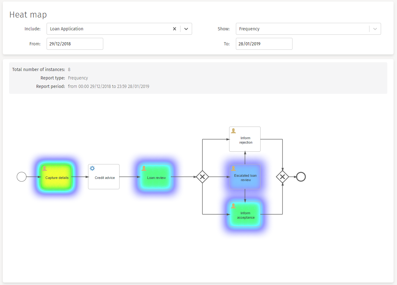
The available options you can use to narrow your diagram are:
-
Include: This option lets you choose a specific process. By default, all processes are included in the graph. After selecting a process, if you want to go back and show all processes again, you can click the X button at the right of the dropdown to deselect the chosen process.
-
Show: With this option you can choose if you want to see the number of instances created (Frequency) or the execution time (Duration). When you choose the Duration option, the Calculate filter appears.
-
Calculate: (Show only if Duration is chosen on the Show filter)
-
Average: Shows the average execution time of the process instances.
-
Minimum: Shows the minimum execution time of the process instances.
-
Maximum: Shows the maximum execution time of the process instances.
-
Total: Shows the total execution time of the process instances.
-
-
-
From - To: With these two options you can narrow the time range where you want your data to be obtained from.